>The Client
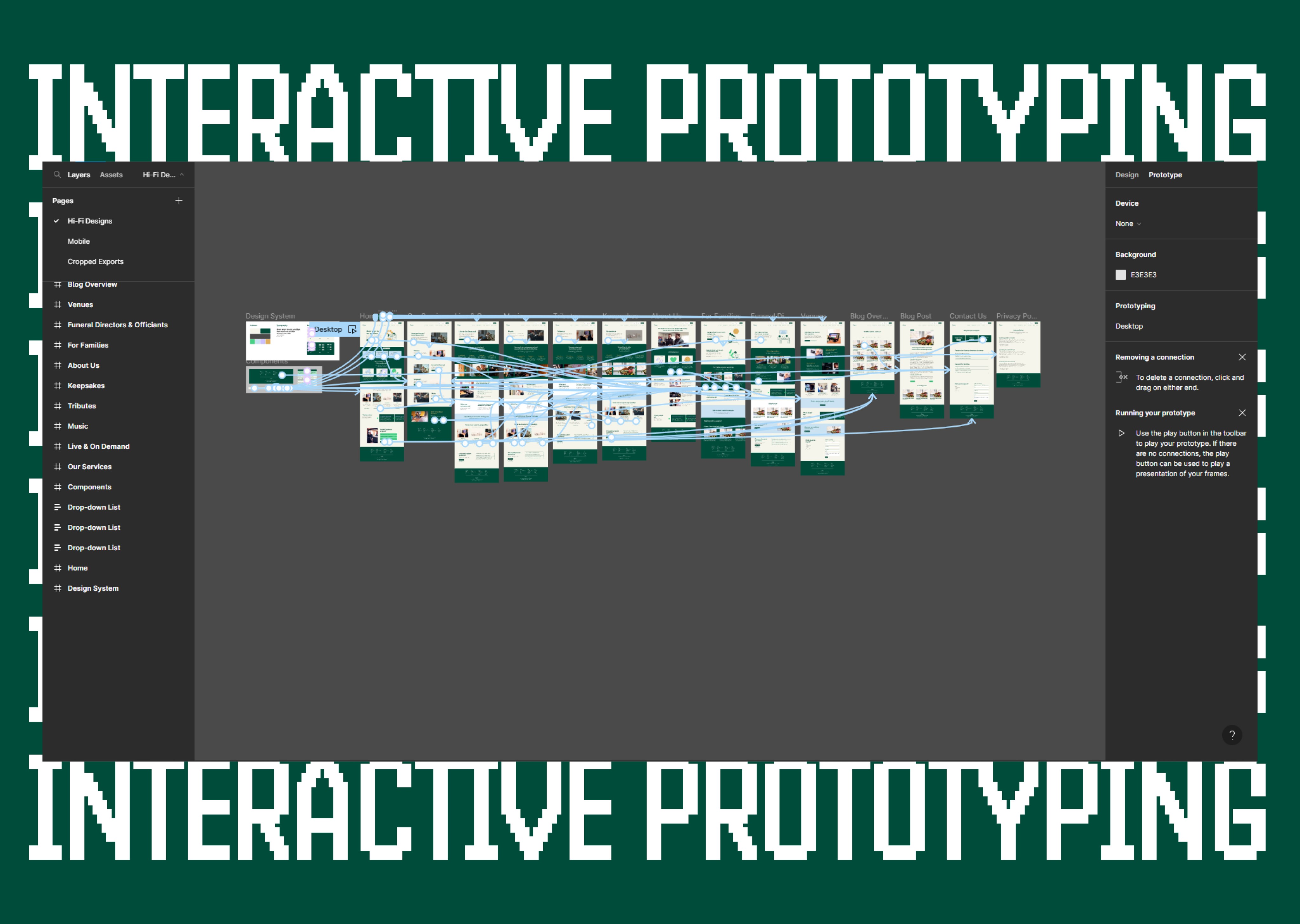
Obitus are a funeral audio and visual service provider who help make funeral services for families more personal. We undertook a significant brand project for Obitus with a website overhaul coinciding with the brand. The purpose of the new website was to expand on their productisation and complex customer relationship through content streams and categorisation. We initially undertook stakeholder workshops to understand their 4 core audiences and their relationship with Obitus, which naturally led us into user journey planning, information architecture, content mapping, wireframing and interactive prototyping.
>AUDIT
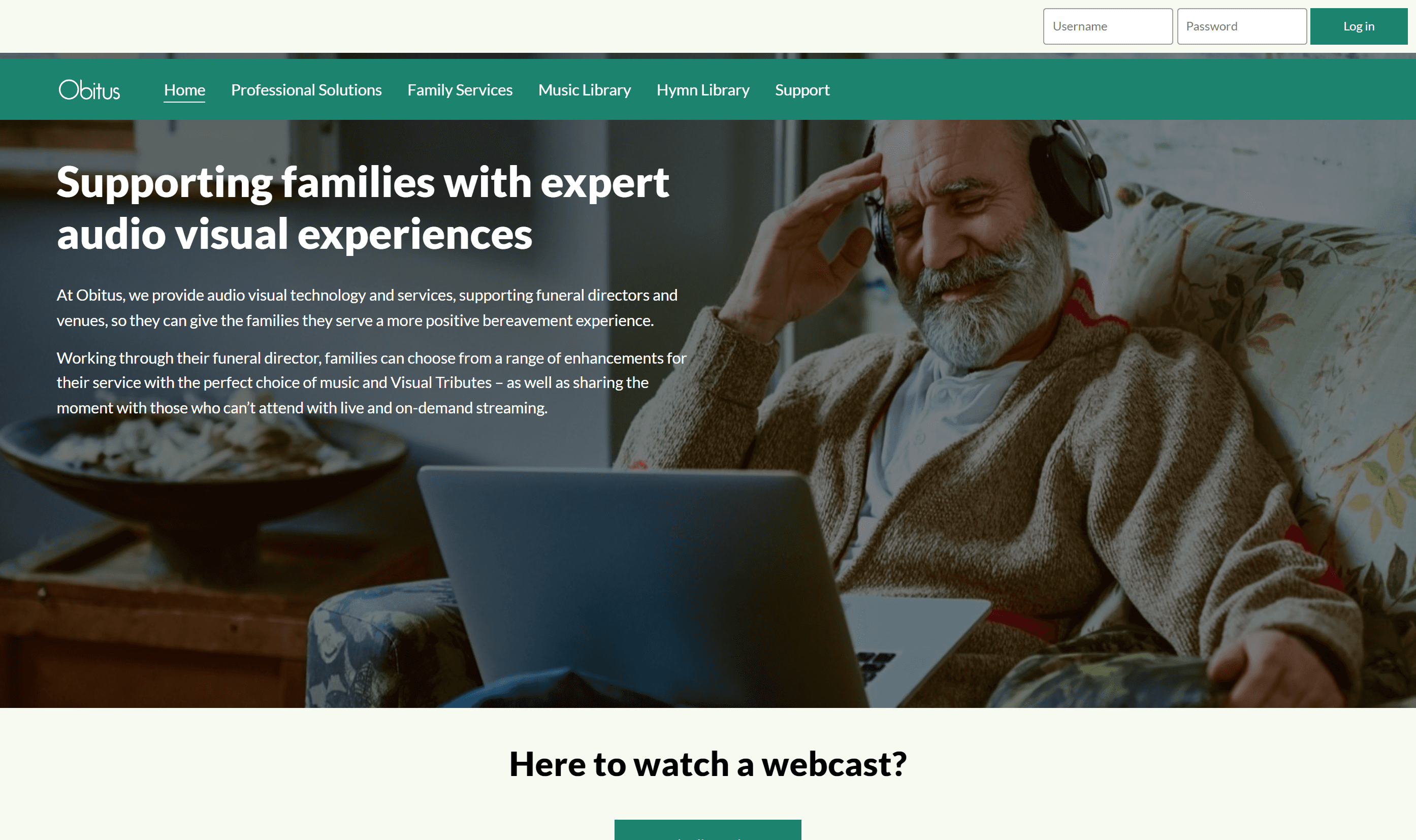
We started by auditing the original Obitus website from a UX, UI and accessibility perspective. This was achieved via a heuristic analysis and the utilisation of HotJar to gain a quantitative understanding of the user flow and their goals. We noticed a consistent neglect of key content pieces on multiple pages, as the majority of users were using back-end services such as watching a funeral live stream or accessing music libraries. Furthermore, we noticed that products which were boldened in content were being mistaken for links - showing an intent to learn more about the individual products.

>Understanding Objectives and Audiences
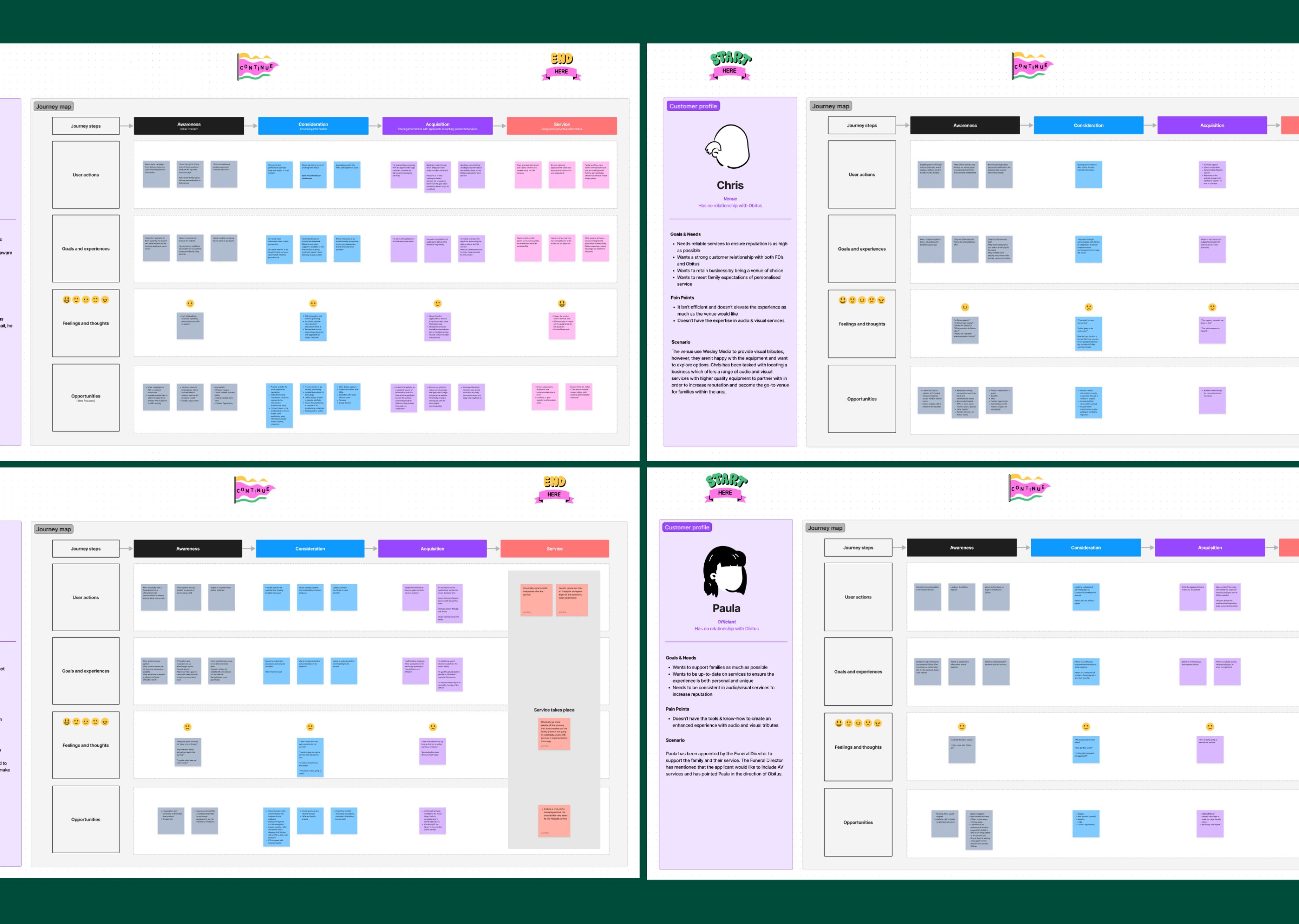
We undertook a series of conversations with key stakeholders to understand why the Obitus website needed redesigning and how their different audiences interact with the business. Our initial findings in the audit exemplified the need to expand the website by including individual product pages, individual audience pages, all underpinned by calculated interaction points to ensure user journeys were optimal and reached their individual goals efficiently. From here, we could start to expand on the flow of the website in the form of user journey mapping.
In mapping the user journey we were specifically looking at the following:
Each audiences goals and needs within their job role and within the customer relationship with Obitus
Pain points
Their general scenario in which they would look to seek for Obitus
Each stage of their journey with Obitus and where the website would interject to complete their goal
Any opportunities for design in which we can alleviate any potential negative experiences
>Information Architecture
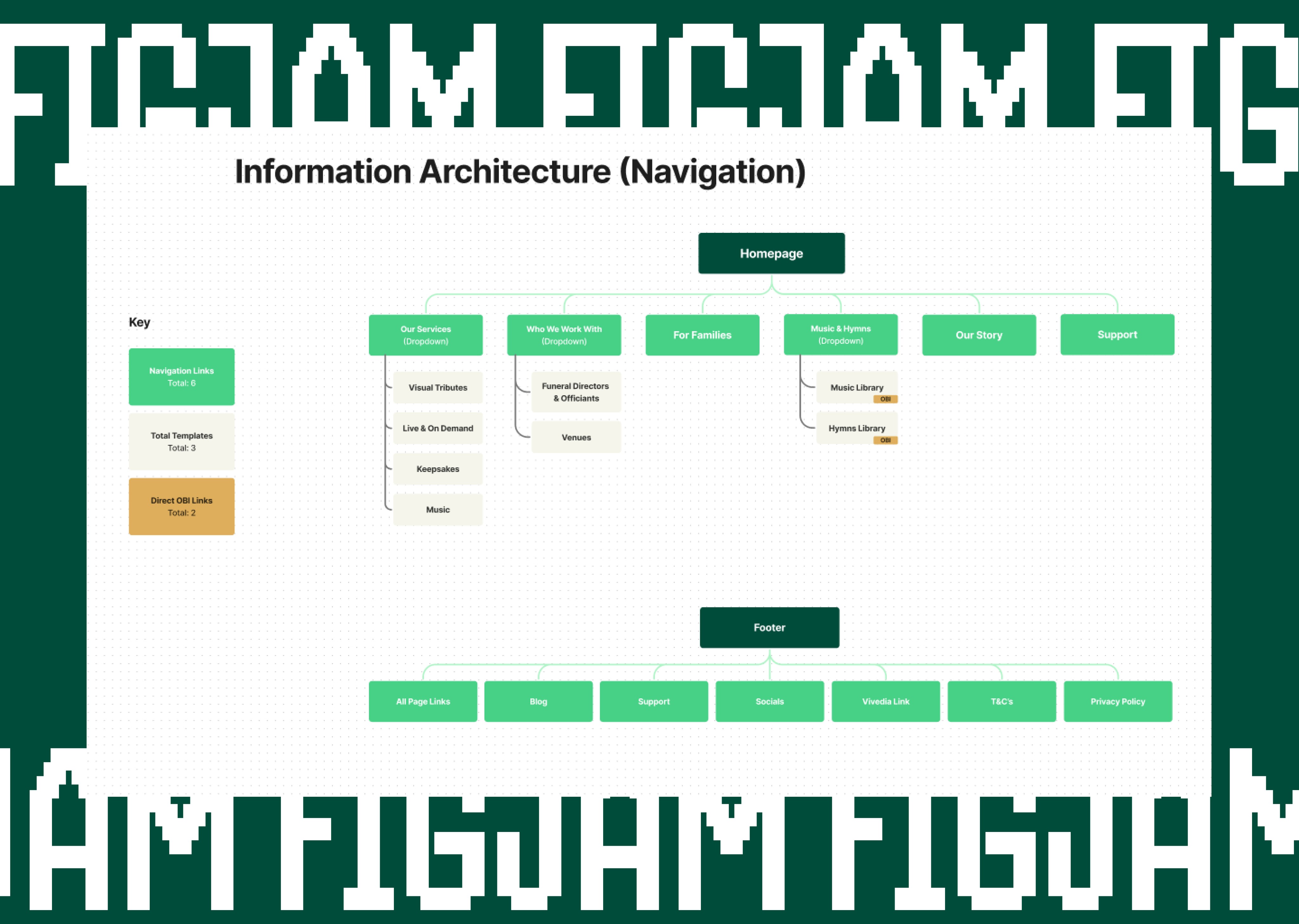
With the website expanding, we needed to produce an information architecture plan to begin categorising and prioritising pages. From this plan, we could then map out content for each page which aligns with the user journey map and the audiences goals. The biggest challenge at this stage of the project was understanding and funnelling 4 different audiences into different areas of the website. Each audience required a specific tone of voice towards each service and how Obitus serves them.
>Wireframing & Interactive Prototyping
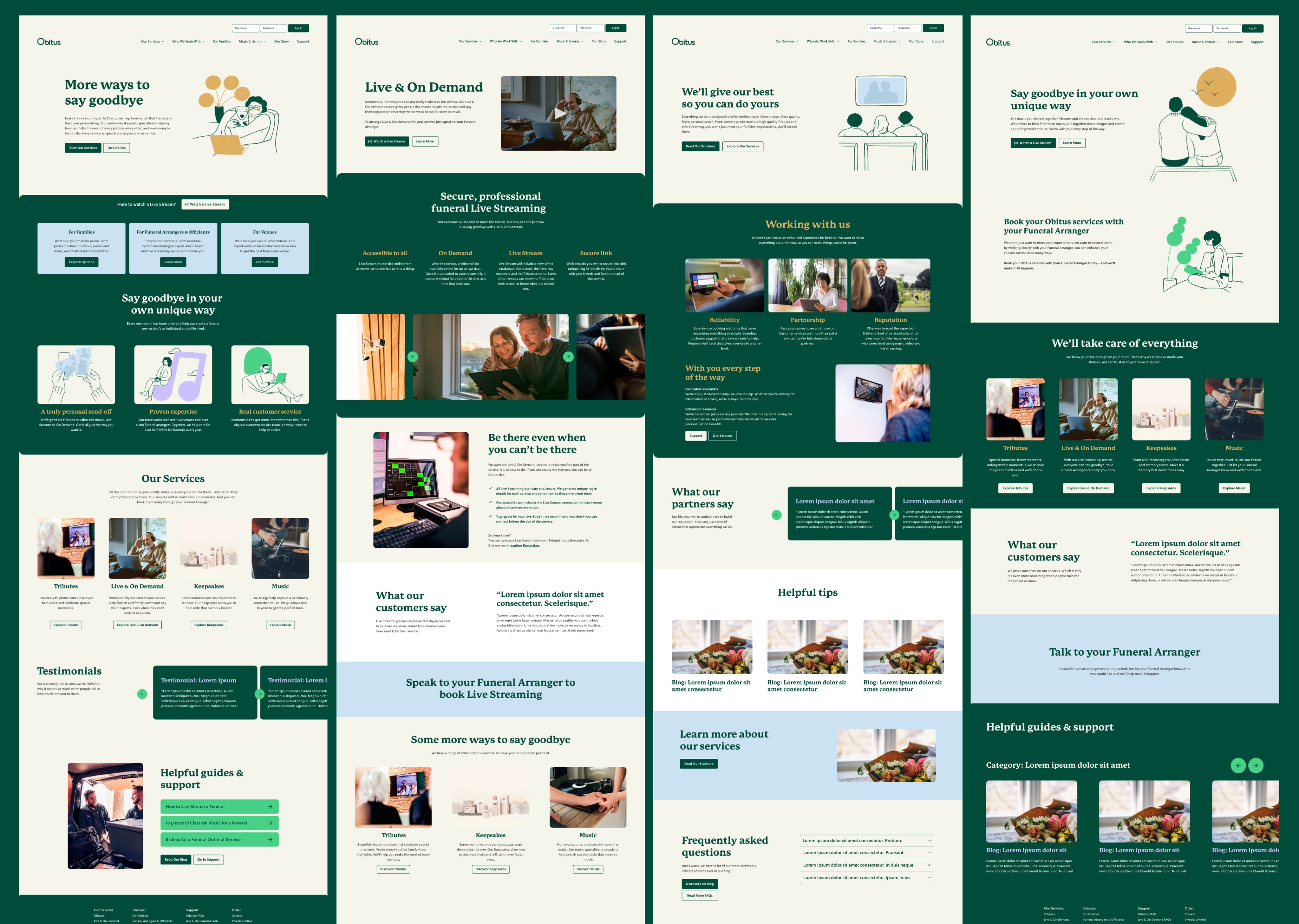
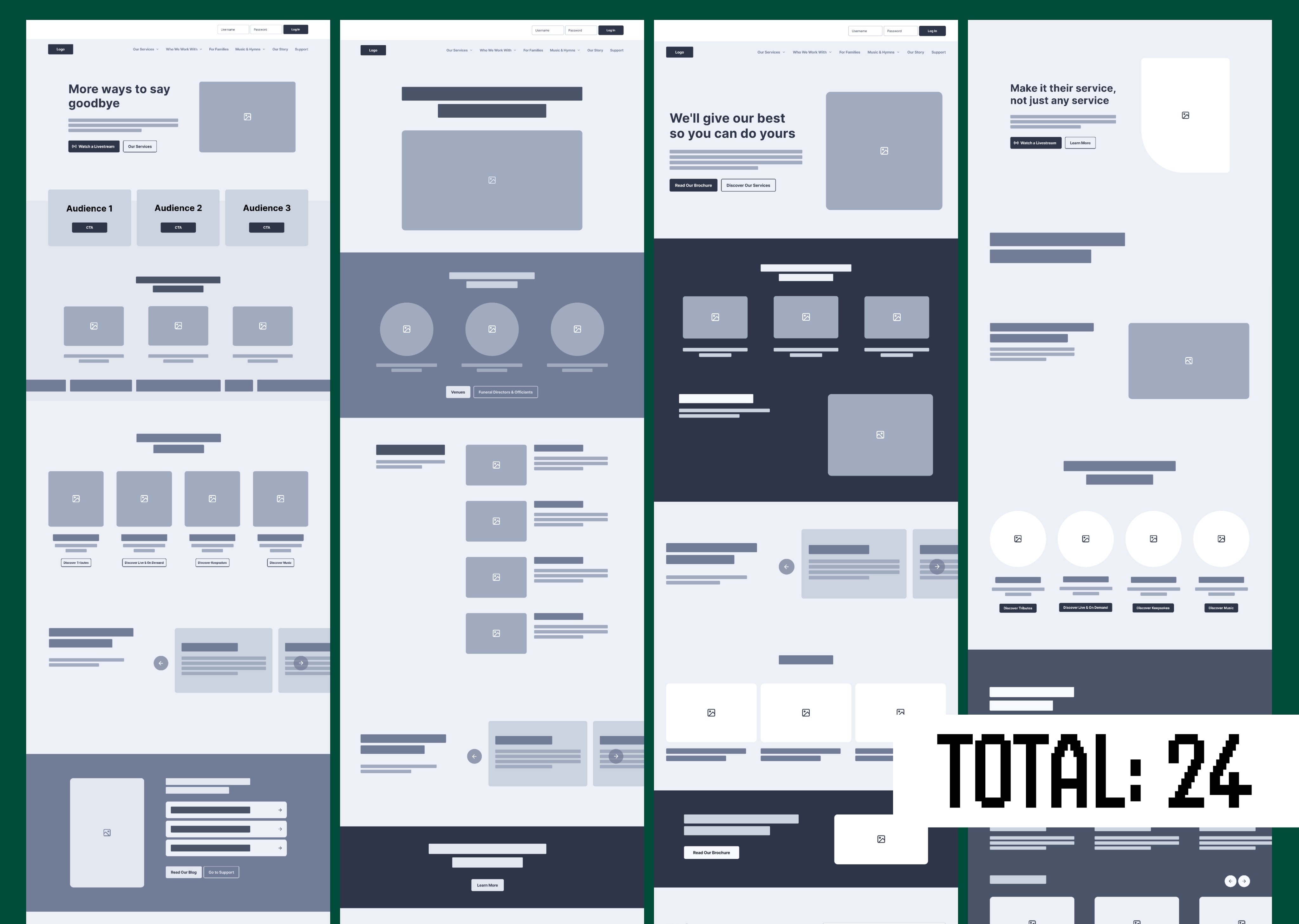
With all UX planning signed off, we moved into the wireframing & prototyping phase of the project. Here we rapidly designed for desktop and mobile to enable a development friendly solution which comfortably met the clients objectives, our content hierarchy and effective interaction points. We extended the challenge of navigating 4 different audiences into the wireframes by introducing a simplified navigation and audience cards on the homepage to move these users into their desired area immediately.
Interactive prototyping meant pushing the new Obitus brand into the digital environment, ensuring colours were of a good contrast to meet WCAG standards, fonts were legible, and photography/illustration was of a good standard for visually impaired users to distinguish elements across the website. Further considerations for accessibility were also recommended, with clear captioning for any video content implemented by the creative team at this stage. To finish the prototype, we implemented finalised illustration, stock imagery, on-location photography and tailored copy with SEO.
