>The Client
Veganuary are a global charity who actively campaign for a more vegan world. They are synonymous with the popular monthly challenge during January where they challenge people to go vegan for a month. Veganuary host resources on their website and through their mailing list, where they noticed a 33% drop in signups during the period of 2021. They required a CRO project to understand why and how potential Veganuary users were not signing up, rectifying these deficiencies through UX and UI to increase signups for the following period. Furthermore, Veganuary were using a third-party solution to take donations, therefore they enlisted us to design and develop an in-house plugin for their development platform, resulting in more control, easier finance management, and a better user experience.

>Using Data to Drive Our Decision Making
Before we could look to improve the user experience and user interface of the website, we first looked to conduct a research plan to truly understand website metrics, the user flow, and any personal opinions users may have. To achieve this, we used Google Analytics, HotJar and a survey sent through Veganuary's mailing list.

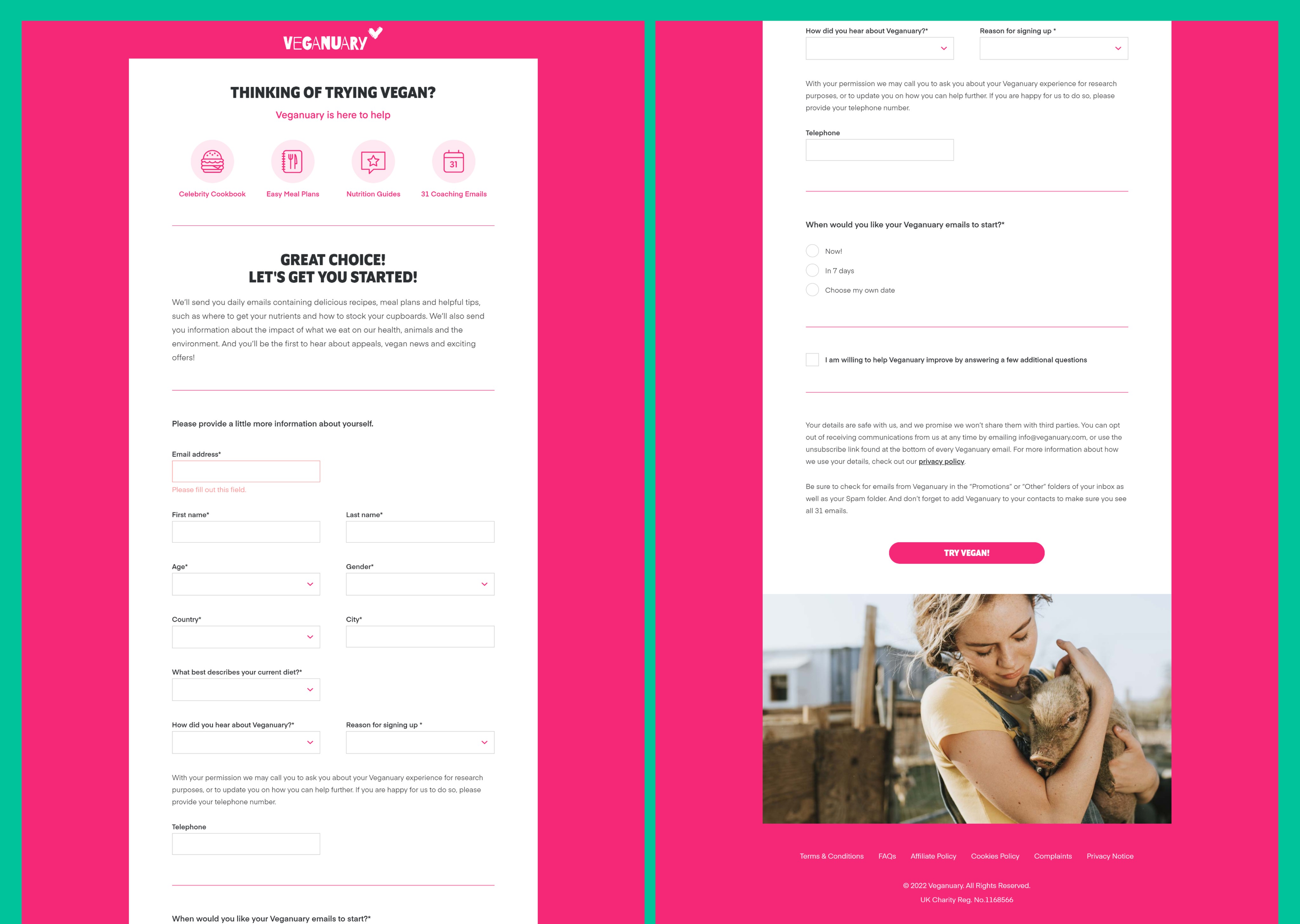
We noticed during HotJar recordings users struggling to signup from other areas of the website, as well as users missing fields in the signup process due to the "required" markers not being immediately recognisable. We combined this with our survey data, where 30% of users didn't feel like they achieved their goals on the website and 50% of did not believe the benefits were easy to access and use.
>The User Journey
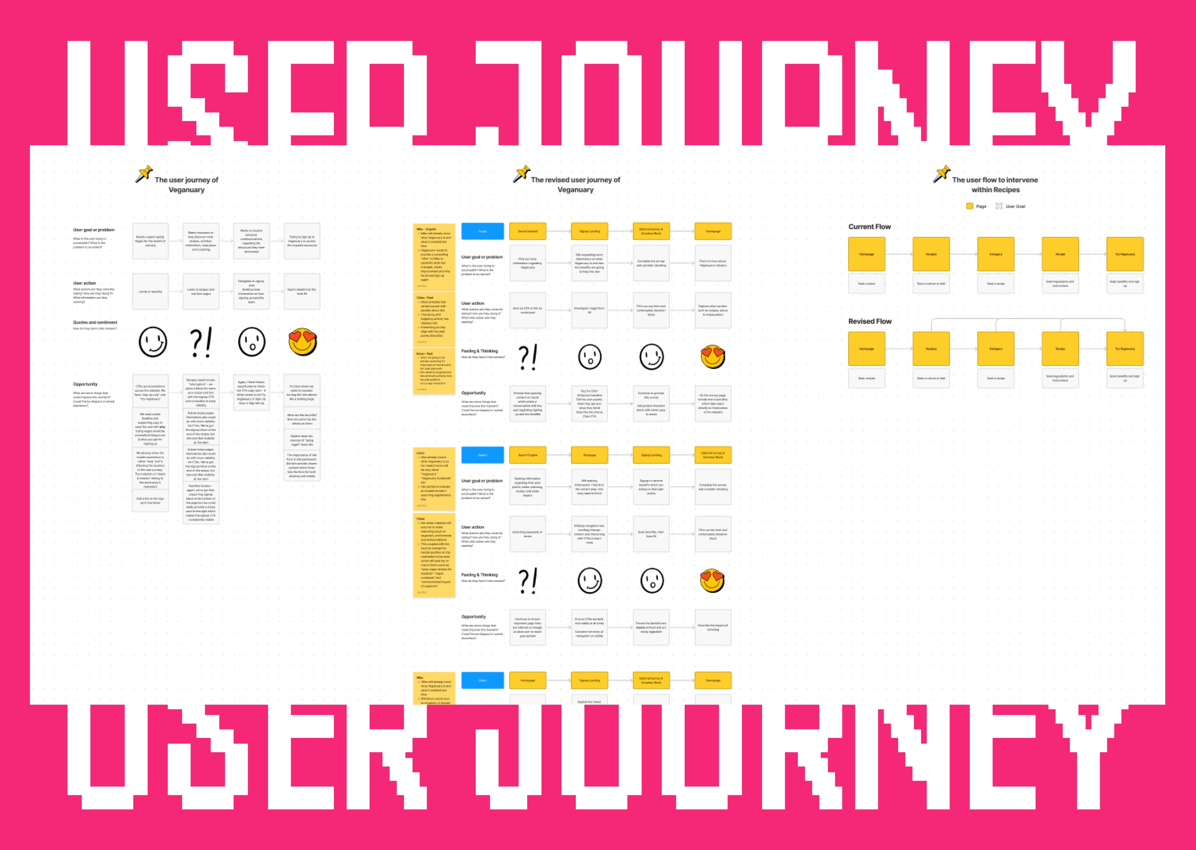
Together with Veganuary, we developed user personas and a user journey map which represented four key acquisitions, direct traffic, organic and paid social, and search. Here we outlined stages to understand user actions and their thoughts/feelings on the way to reaching and completing their goal. It was understood we would target the signup process and provide more visibility of signing up and the benefits users receive through the most popular journeys on the website.

>Wireframes and Prototypes
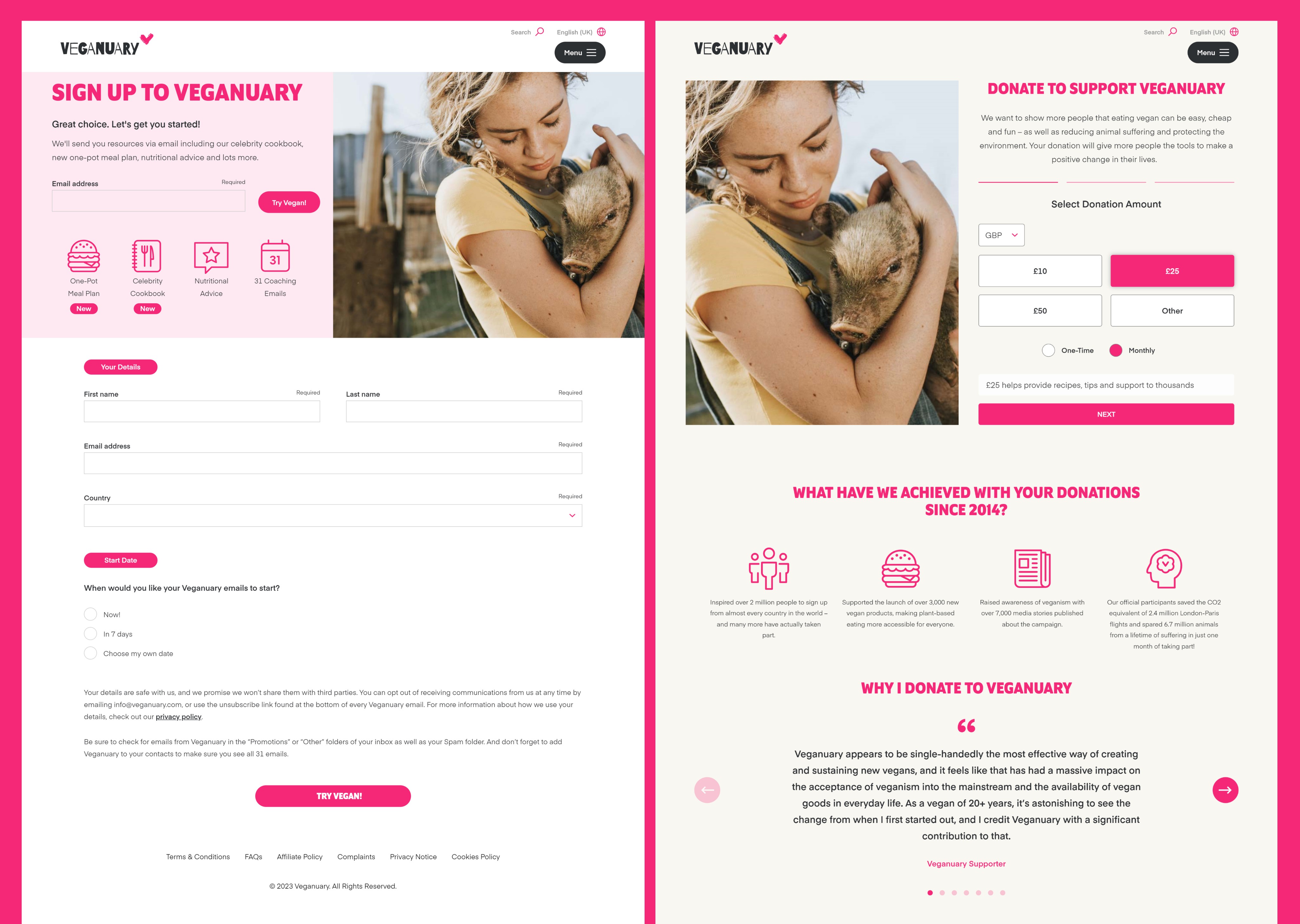
Actioning these priorities meant moving into Adobe XD to wireframe small design changes in relation to the homepage, signup page, recipes flow and donation page. (Design files are limited)

> User Testing
To ratify our design decisions and keep the project user-centric, we commenced a user testing plan using Useberry to formulate different methods of testing. Here we used a number of tasks to ensure our quantitative data sufficiently communicated new strengths, existing weaknesses and potential opportunities to iterate on our design.
Location - to determine whether our user journey adjustments are successful in time completion and collective optimal routes
Timed Content - To understand whether new content structures and copy are easily readable and digestible
Preference - To discover how content compositions on the donation page affects people understanding why to donate
System Usability Scale (SUS) - to gauge a general quantitative usability score based on qualitative questions using a likert scale
We gathered a total of 26 participants and allocated them a device version equally - desktop and mobile. Here participants would complete the same tasks as one another but with different devices to understand the interaction level of the user experience.
Overall, we saw an average of 24 seconds to signup on desktop and 13 seconds on mobile. We also saw an average of 21 seconds to simulate donating to Veganuary on both desktop and mobile. The average SUS score was 72 which is universally ranked as A.
However, we still engaged in informal conversations after the formal testing period to gain further subjective opinions from participants. These opinions assisted in iterating designs once more to finalise the project.
